
Now that Notion finally has charts, it's time to visualize the data we've been collecting over time. Choosing the right chart can make the difference between clear, effective data communication and a confusing or misleading presentation.
We'll need to consider the nature of the data we want to display, the different types of charts available in Notion, and the context of what we want to show.
Understanding Data Types
Different types of data require different visualization approaches. In Notion, we can visualize various types of database information in different ways.
Categorical Data
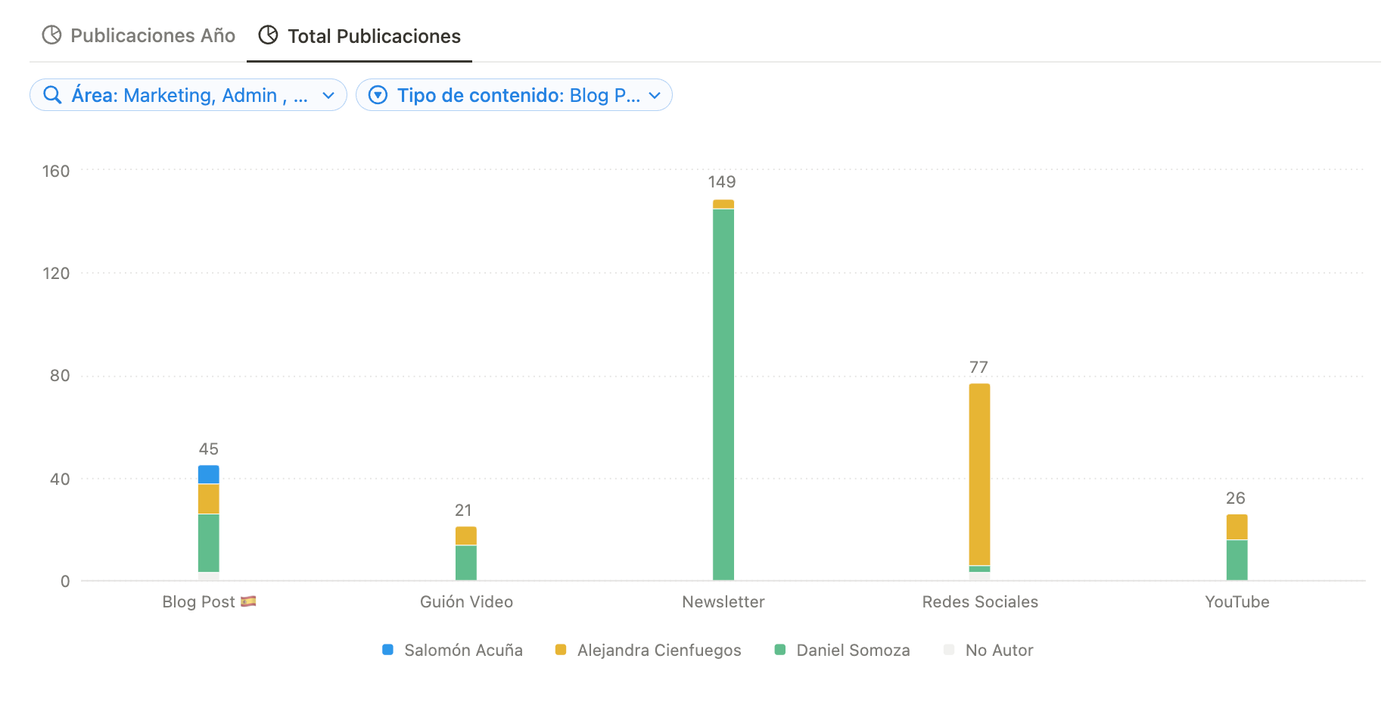
This type of data helps categorize information. In Notion, these typically correspond to select and multi-select properties. In other words, data that divides into distinct groups without inherent order.
Examples include:
- Company departments (HR, Marketing, Finance, Sales)
- Smartphone brands (Apple, Xiaomi, Pixel, OnePlus, Nokia)
- Transaction types (Expense, Income, Transfer)
For this type of data, bar charts are usually most recommended, though the final choice depends on your communication goals.
Numerical Data
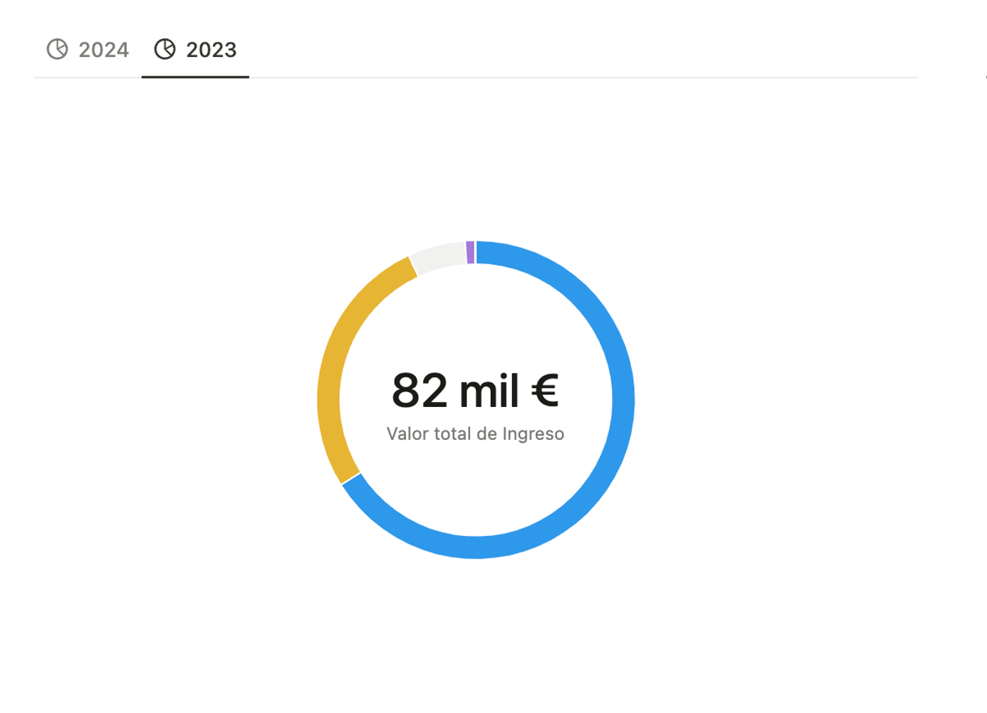
Simply put, these are quantitative data you can sum, average, and analyze further.
Examples include:
- Company income/expenses
- Website visits
- Number of sales
- Meeting frequency
Depending on your context and goals, you might choose between horizontal bar charts or donut charts.
Time-Series Data
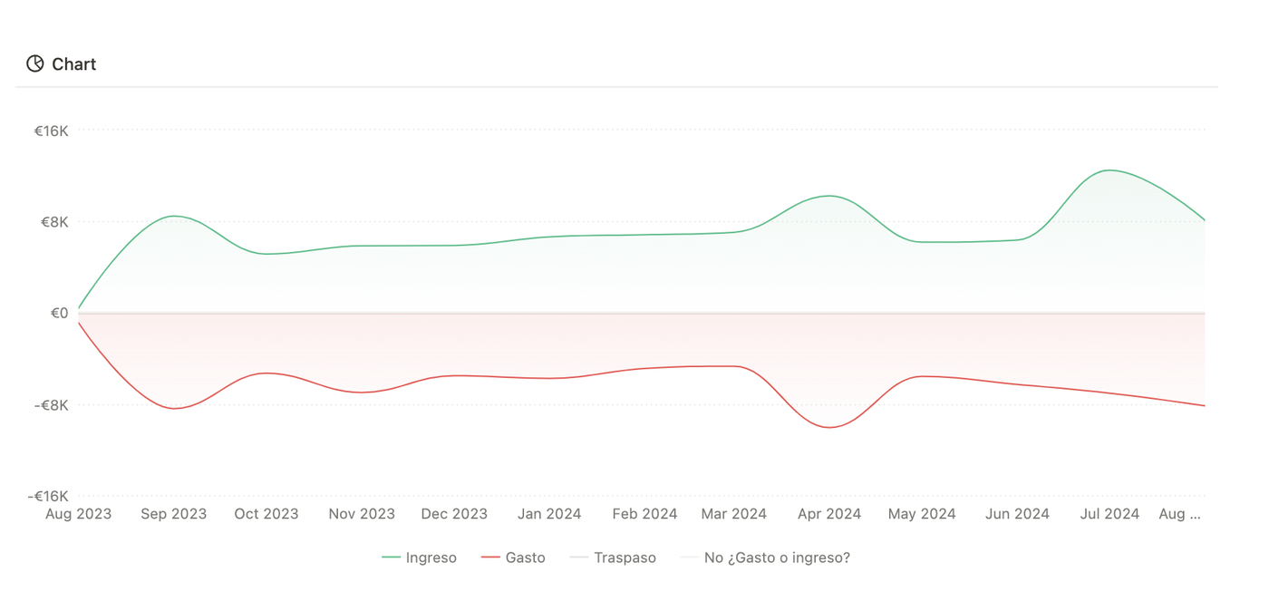
This data shows changes over time. What's usually important isn't the time data itself, but rather how other data types evolve over time.
Examples include:
- Monthly unemployment rate
- Weekly website visits
For temporal data, line charts will be your go-to choice 80% of the time, as they best visualize trends.
Visualization Goals
Beyond data types, having a clear objective is crucial. Ask yourself: "What do I want users to see?" Answer this, and you'll likely make the right chart choice.
Comparison
When comparing categories, choose between bar charts and pie charts. Grouping becomes important here - for example, comparing product sales by city using a bar chart where each bar represents a region and colors represent products.
Distribution
For scenarios like viewing team workload distribution, use horizontal bar charts sorted from highest to lowest. This instantly shows who has the heaviest workload and who could take on more.
Trends and Composition
For trends, we're looking to identify patterns that could inform decisions. For example, recognizing that sales drop 40% every summer. Line charts in Notion work best for this.
For composition, donut charts excel at showing whether elements are balanced or skewed at a glance.
Additional Considerations
Beyond data types and visualization goals, consider:
- Audience: For general audiences, keep charts simple and ungrouped
- Data quantity: Simple charts for small datasets, grouped/filtered/sorted for larger ones
- Context: Adapt your presentation based on audience familiarity with the data
Conclusion
Notion's charts have revolutionized how we build in this tool. This release marks a before and after. Understanding how charts work and their full potential is now fundamental.